Appearance
Grid Positioning
Grid positioning controls how many cells a column occupies and its placement within the grid.
⚙️ Grid Cells
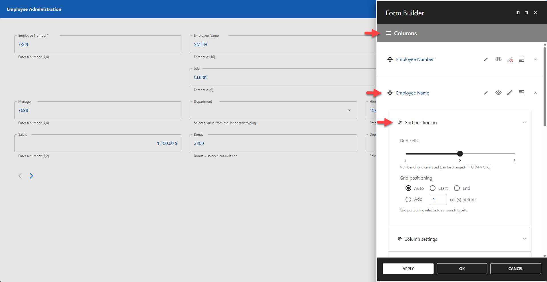
The number of grid cells a column occupies. The slider's maximum value depends on the Cells Per Row setting defined in the Grid menu.
The screenshot shows a grid with Cells Per Row set to 3. The Employee Name column has Grid Cells set to 2.
⚙️ Grid Posistioning
The position of the column relative to surrounding cells.
- Auto: Follows the normal flow, placing the column in the next available cell.
- Start: Forces the column to the first cell of the next row.
- End: Forces the column to the last cell of the current row.
⚙️ Add cell(s) before
Adds empty cells before the column.
The screenshot shows one empty cell before the Employee Name column.
⚙️ Add a Separator Before This Column
Adds a separator before the selected column. The separator spans the entire row above the selected field, even if the grid contains multiple columns.
⚙️ Title
Optionally, a title can be added to the separator. The title is left-aligned and appears below the separator. Its style can be adjusted in the CSS Form Editor.
✨ Example Title Alignment
css
.row-separator {
  justify-content: center;
}
✨ Example Title Styling
css
.row-separator > span {
  color: red;
}
⚙️ Add a Separator After This Column
Adds a separator after the selected column. The separator spans the entire row above the selected field, even if the grid contains multiple columns.