Appearance
Detail Panel
⚙️ Allow Detail Panel Viewing
Adds an expand icon to each row, allowing users to view row details in a dedicated panel.
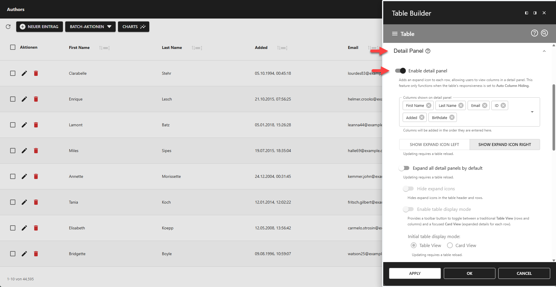
📌 This feature only functions when the table's responsiveness is set to Auto Column Hiding.
⚙️ Columns Shown on Detail Panel
Adds columns to the detail panel in the order they are added to this field.
⚙️ Expand Icon Position
Defines the position of the expand icons (LEFT or RIGHT).
⚙️ Expand All Detail Panels By Default
Use this feature to expand all rows on startup.
⚙️ Hide Expand Icons
Hides all expand icons in the table header and footer.
📌 Only available if Expand All Detail Panels By Default is enabled.
⚙️ Enable Table Display Mode
Adds a toolbar button to toggle between a traditional Table View (rows and columns) and a focused Card View (expanded details for each row).
Table View
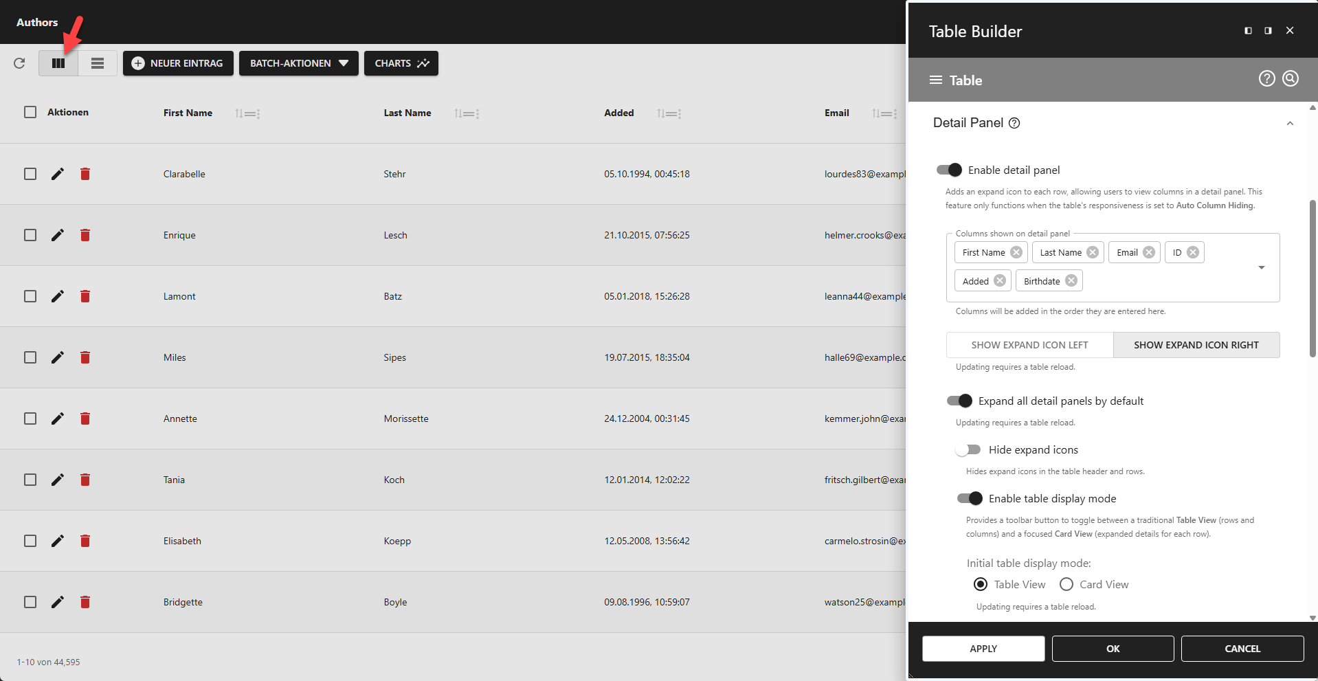
Card View

📌 Only available if Expand All Detail Panels By Default is enabled.
⚙️ Initial Table Display Mode
Table View - Start app in Table View mode.
Card View - Start app in Card View mode.
⚙️ Add PDF Export Icon
If detail panel viewing is enabled, this option adds a PDF Export icon to the detail panel, allowing users to export the specific row's data to a PDF file.
⚙️ Detail Panel Styling
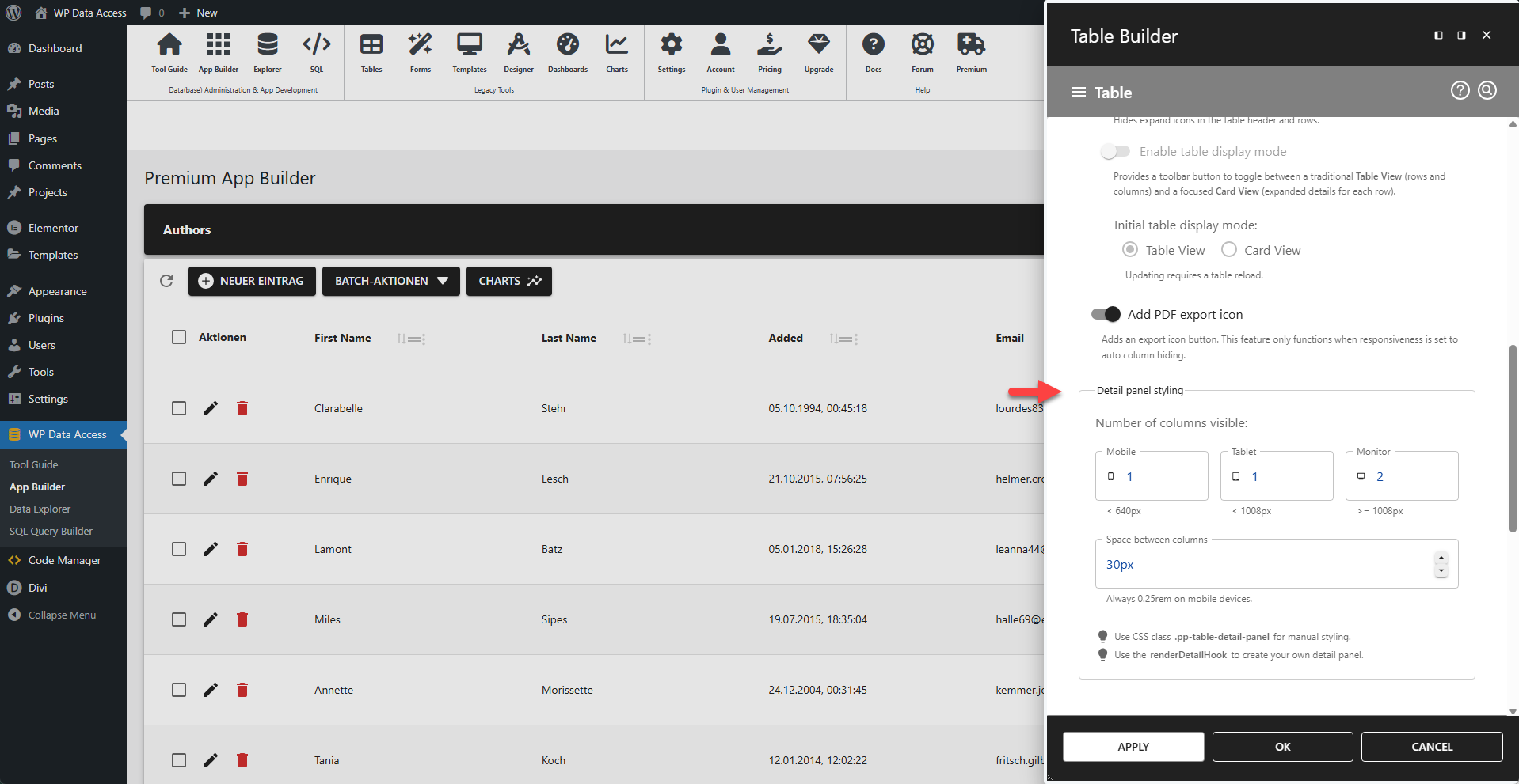
Number of Columns Visible
⚙️ Mobile
Number of columns shown on mobiles (width < 640px).
⚙️ Tablet
Number of columns shown on tables (width < 1008px).
⚙️ Monitor
Number of columns shown on PC's and laptops (width >= 1008px).
⚙️ Space Between Columns
Space between columns.
📌 Always 0.25rem on mobile devices.
💡 CSS Styling
Use CSS class .pp-table-detail-panel for manual styling. Read more...
💡 Custom Detail Panel
Use the renderDetailHook to create your own detail panel. Read more...