Appearance
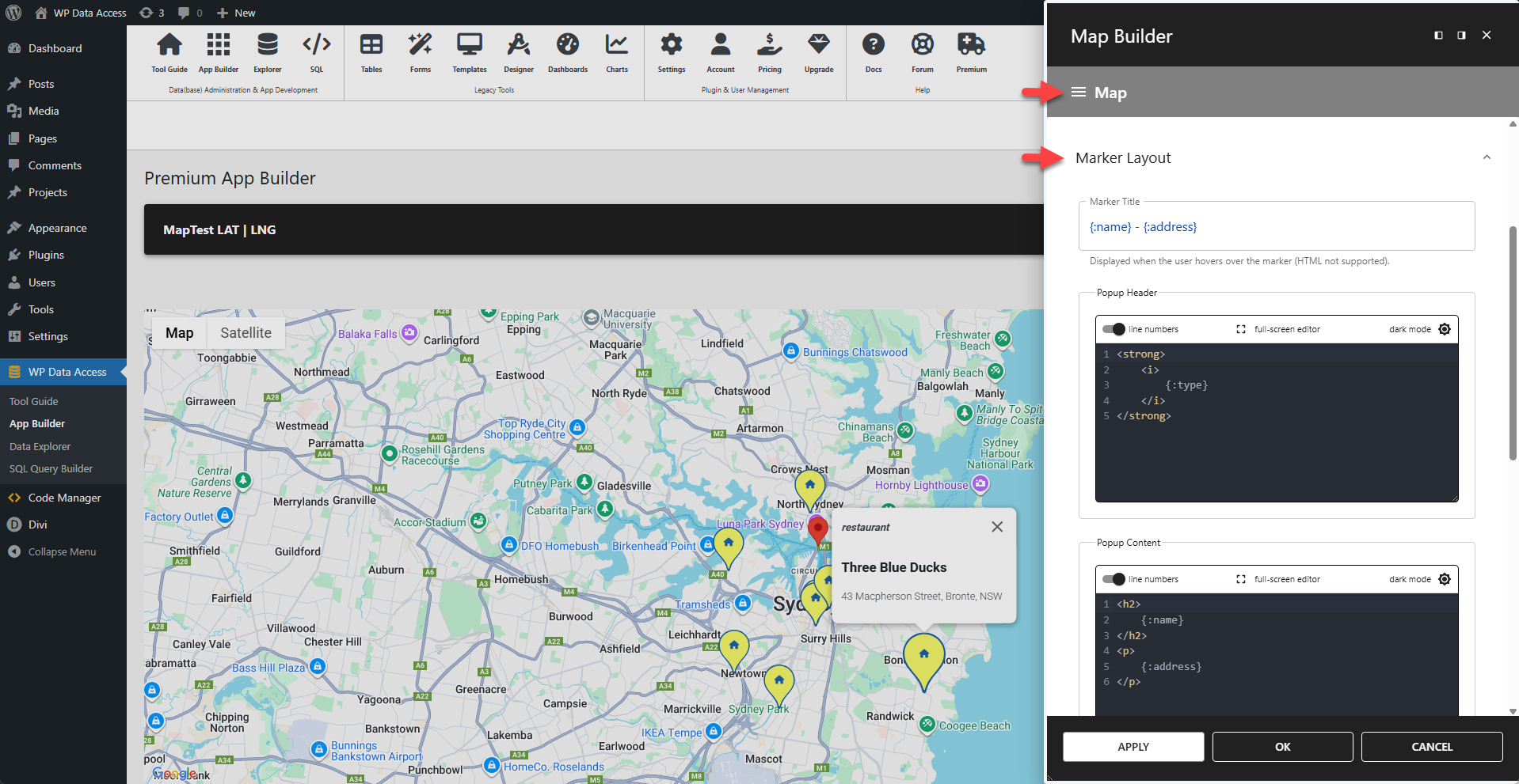
Marker Layout
Defines the layout for all data point markers. This does not affect the marker for the initial location.
📌 The marker title, header, and content fields support placeholders for column value substitution.
📌 Placeholder format: {:columnName}
⚙️ Marker Title
Displayed when the user hovers over the marker. HTML is not supported.
✨ Example
Substitutes placeholders with the values from the
nameandaddresscolumns.
html
{:name} - {:address}⚙️ Marker Header
The text for the marker's header. HTML is supported.
✨ Example
Substitutes a placeholder with the value from the
typecolumn.
html
<strong>
	<i>
		{:type}
	</i>
</strong>
⚙️ Marker Content
The text for the marker's body content. HTML is supported.
✨ Example
Substitutes placeholders with the values from the
nameandaddresscolumns.
html
<h2>
	{:name}
</h2>
<p>
	{:address}
</p>
⚙️ Marker Size
Sets the size of the marker. Accepts any value from 0 to 8.
⚙️ Marker Colors
Offers color pickers for the marker's background color, border color, and glyph color.
⚙️ Custom Glyph
Replaces the default glyph with a custom icon.
✨ Example
To display a house icon instead of the default glyph:
html
<i class="fa-solid fa-house"></i>📌 This example requires Font Awesome to be loaded on the page.