Appearance
Layout & Responsiveness
The Layout & Responsiveness panel allows you to fine-tune the table's layout and behavior across different devices.
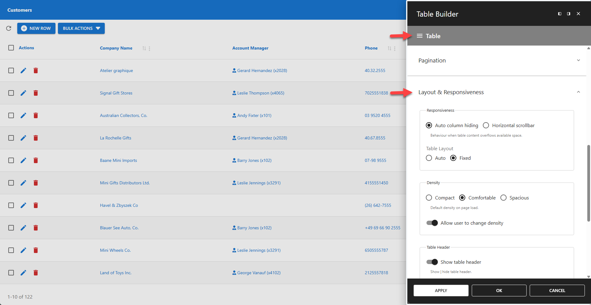
⚙️ Responsiveness
This setting provides two methods for handling tables that are wider than their container.
Auto column hiding
Automatically hides the right-most columns based on the screen or container size.
Horizontal scrollbar
Adds a horizontal scrollbar at the bottom of the table to allow scrolling through all columns.
✨ Example: Auto Column Hiding vs Horizontal Scrollbar
The table layout is set to FIXED by default, which improves rendering when Auto Column Hiding is enabled. The AUTO setting remains available for backward compatibility.
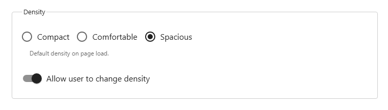
⚙️ Density
Controls the vertical spacing within the table.
Three density settings are supported:
- Compact
- Comfortable
- Spacious (default)
By default, users can change the density interactively. Unchecking Allow user to change density locks the density for all users.
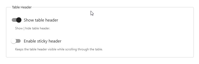
⚙️ Table Header
Controls the visibility of the table header. Visible by default.
📌 When Sticky header is enabled, the header remains fixed at the top of the viewport as the user scrolls.
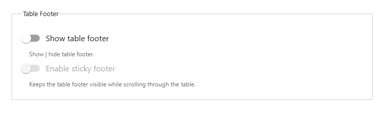
⚙️ Table Footer
Controls the visibility of the table footer. Hidden by default.
📌 When Sticky footer is enabled, the footer remains fixed at the bottom of the viewport as the user scrolls.
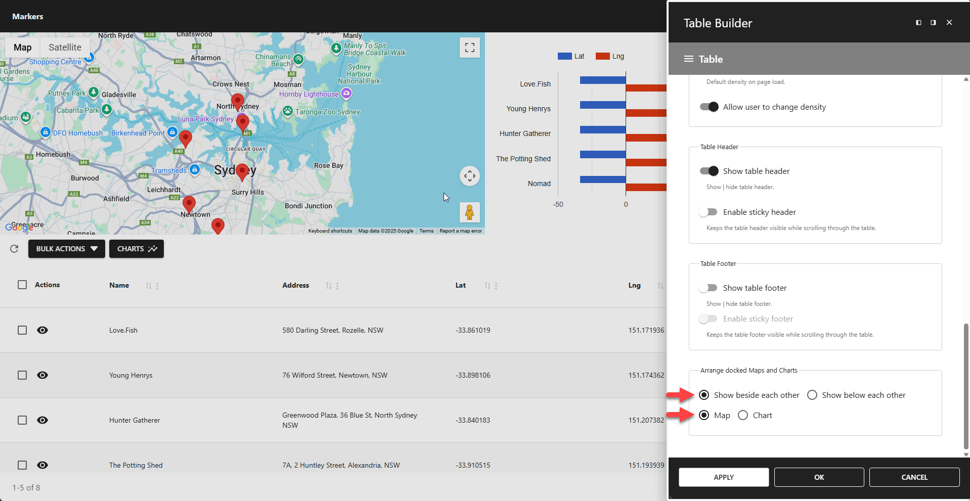
⚙️ Arrange Docked Maps and Charts
Maps and charts can be docked in the table header and footer. When a table contains both, this setting defines their arrangement. The first option controls whether they are displayed side-by-side or stacked. The second option defines which component appears first.