Appearance
Grid
The form grid is a structural system that organizes all form fields into rows and cells. This ensures a consistent, aligned, and responsive layout. The number of cells in each row is defined by the Cells Per Row setting. Individual fields can span multiple cells within a row, allowing for flexible column widths.
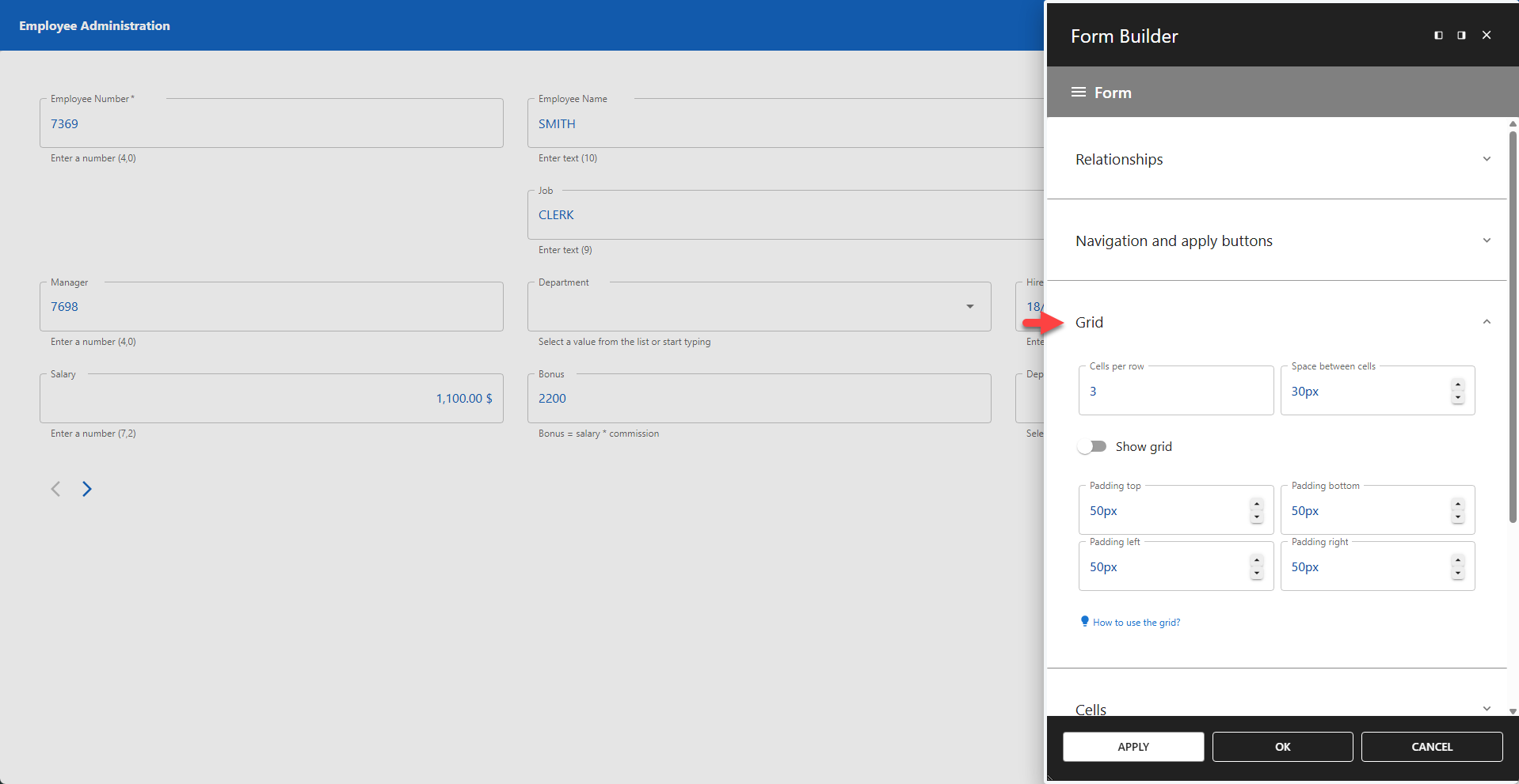
⚙️ Cells Per Row
Defines the maximum number of cells available in each row (default = 1). Individual columns can be configured to span a specific number of these cells, allowing you to create wider or narrower fields.
To control how many cells a specific column occupies, use the Grid Positioning settings for that column.
⚙️ Space Between Cells
Defines the gap (gutter) between cells within a row (default = 30px).
⚙️ Show Grid
Toggles the visibility of the grid lines in the Form Builder editor. This is a design-time aid to help visualize layout and is not visible to users when the form is published. This feature is disabled by default.
Padding
You can adjust the padding of the form grid against the form container. The default value is at 50px on all sides.
⚙️ Padding Top
Space reserved above the grid.
⚙️ Padding Bottom
Space reserved below the grid.
⚙️ Padding Left
Space reserved to the left of the grid.
⚙️ Padding Right
Space reserved to the right of the grid.
⚙️ Gap Between Containers
Space reserved between containers.