Appearance
Getting started with the Table Builder
Every Data Table and Data Administration app contains at least one table component, which is based on a database table or view. The master table provides access to the columns added in the App Manager. For relationships, the columns provided in the detail table are defined in the Relationship section of the Table Builder or Form Builder.
Accessing the Table Builder
The Table Builder icon is available on the toolbar.
To access the Table Builder:
- Open your WP Data Access dashboard.
- Navigate to the App Builder.
- Click the Run & Build link or icon for your app.
- Click the Table Builder icon on the toolbar.
Use the Table Builder buttons in the table footer to access the Table Builder for detail tables.
📌 Detail tables are added automatically for Relationships.
Table User Interface

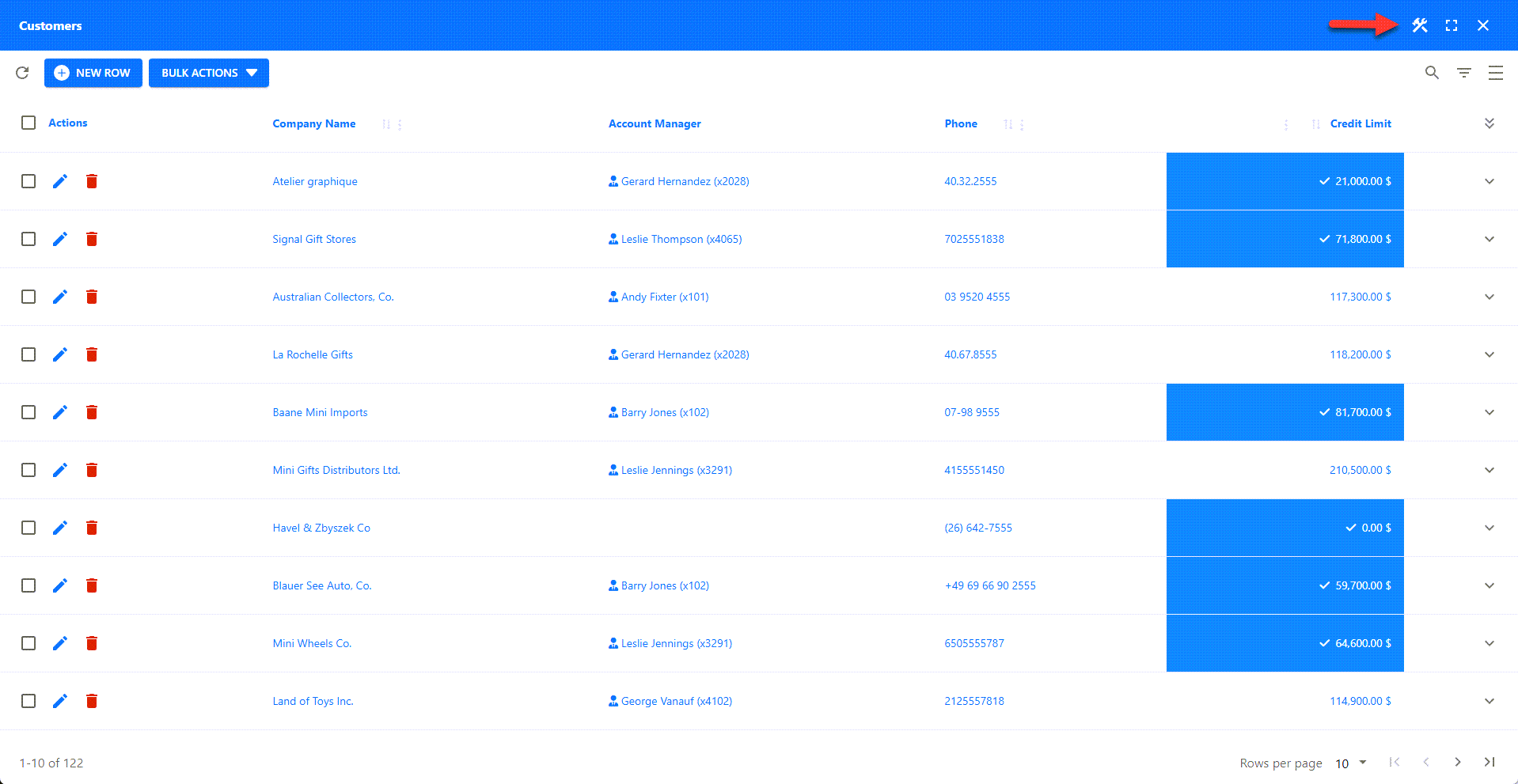
💡 Use the markers (A-I) shown in the screenshot above to identify the configurable options described below. Follow the links for more detailed information.
[A] App Title
The app title is displayed on the toolbar. You can change the title in the App Manager. You can apply additional CSS styles using the CSS class pp-toolbar-title. It is also possible to hide the toolbar and title completely on webpages using the shortcode parameter hidetitlebar.
[B] Toolbar Icons
Toolbar icons are located on the right side of the toolbar.
🛠️ Builder Icon
The left icon is the Builder icon, which allows administrators to access the Table Builder. The Builder icon is available on both the back-end and the front-end. You can disable it on the front-end using the shortcode parameter builders.
⛶ Full-Screen Mode
The second icon allows users to toggle between full-screen and windowed mode. This icon is only available to premium users. Full-screen mode can be disabled in the App Manager.
⛌ Close Icon
The Close icon is only available when an app is started from the App Builder. It allows administrators to close the app and return to the App Builder.
[C] Table Actions (LEFT)
Table action buttons located on the left side between the toolbar and the table.
⟳ Refresh Button
The Refresh button re-queries the database table or view and rebuilds the table.
🆕 NEW ROW Button
The NEW ROW button allows users to switch from table view to form view to insert a new row. The label of this button is localized. Premium users can also overwrite label translations. Inserting new rows can be disabled, which will remove the NEW ROW button.
✅ Bulk Actions
Bulk actions allow users to perform tasks on multiple rows simultaneously. To perform a bulk action, the user must select at least one row by clicking the checkbox in the row's actions column. You can enable or disable bulk actions in the Table Builder. The bulk actions button is removed if all bulk actions are disabled.
📊 Charts Button
The Table Builder supports adding charts to the table header or footer for premium users. For free users, charts are available via a chart button. (read more...)
📌 This feature is not displayed in the screenshot.
🌎 Maps Button
The Table Builder supports adding maps to the table header or footer for premium users. For free users, maps are available via a map button. (read more...)
📌 This feature is not displayed in the screenshot.
✨ Custom Buttons
The customActionsTop hook allows you to add your own custom actions using buttons, icon buttons, and other HTML elements.
📌 This feature is not displayed in the screenshot.
[D] Table Actions (RIGHT)
Controls displayed on the right side above the table.
🔎 Global Search
The global search field allows users to search across all searchable columns. This feature can be disabled in the Table Builder. (read more...)
▼ Column Filter
Column filters must be activated for each column individually. The Table Builder supports multiple filter types. (read more...)
𝄜 Show | Hide Columns
This feature allows users to interactively show, hide, and reorder columns. It must be specifically enabled for an app. (read more...)
📌 This feature is not displayed in the screenshot.
☰ Toggle Density
This feature controls the vertical spacing within the table. By default, users can toggle between three different modes. User interaction can be disabled in the Table Builder, allowing administrators to enforce a specific density for all users. (read more...)
[E] Row Actions
The row actions column contains user-selectable actions. By default, a checkbox and a view icon button are added. Edit and delete icon buttons are added to data administration apps if the database table has a primary key. These buttons are not available in data table apps or for database views.
❎ Checkbox
All rows with a selected checkbox are included in bulk actions.
🔍 View Icon Button
The View icon button allows users to switch from table view to form view to see the selected row's details. This feature can be disabled in the Form Builder. (read more...)
📌 This feature is not displayed in the screenshot.
📝 Edit Icon Button
The Edit icon button allows users to switch from table view to form view to update the selected row. This feature can be disabled in the Form Builder. (read more...)
💡 The form view can replace the table view or appear on top of it as a modal. (read more...)
🗑 Delete Icon Button
Clicking the Delete icon button launches a confirmation popup. The row is deleted from the database table if the user confirms the action. This feature can be disabled in the Form Builder. (read more...)
[F] Table Columns
The table in the screenshot has six visible columns. The first column contains the row actions, and the last column has an icon button to expand the row data. The four middle columns are data columns. The Company Name and Phone columns display the original database data. The highlighted Account Manager column is a computed field. The Credit Limit column uses a renderer to change the color, background color, and conditionally add a prefix and suffix. This is just a small sample of what is possible with the Table Builder.
> How can I add a prefix or suffix to a table column?
> How can i add a renderer to a table column?
> How can i add a computed field to a table?
[G] Expand Row
Expanding rows is an alternative to viewing rows. To enable this feature, enable allow detail panel viewing in the Table Builder. (read more...)
💡 If you enable this feature, we advise disabling allow viewing, as they serve the same purpose.
> How can I disable allow viewing?
[H] Page and Row Count
The page and row count are shown on the left below the table. This information can also be displayed above the table, or both above and below.
📌 This display location can be configured in the Table Builder. (read more...)
📌 This information can be hidden using the CSS classes pp-bottom-toolbar, pp-bottom-toolbar-container, or pp-table-info.
[I] Pagination
Pagination controls are shown on the right below the table. This can also be displayed above the table, or both above and below.
📌 This display location can be configured in the Table Builder. (read more...)
📌 This information can be hidden using the CSS class pp-bottom-toolbar.