Appearance
Getting started with the Form Builder
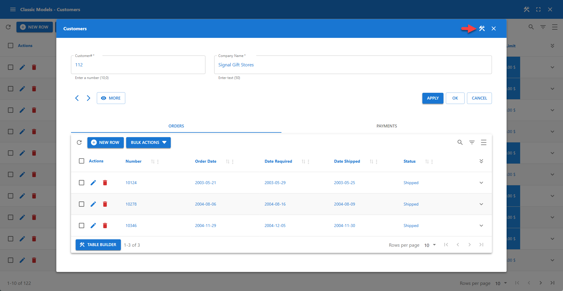
Every Data Table, Data Administration, and Registration app contains at least one data entry form, which is based on a database table (or view). The master table provides access to the columns added in the App Manager. For relationships, the columns provided in the detail table are defined in the Relationship section of the Table Builder or Form Builder.
Accessing the Form Builder
The Form Builder icon is available on the toolbar.
- Open your WP Data Access dashboard.
- Navigate to the App Builder.
- Click the Run & Build link or icon for your app.
- To launch the data entry form for the master table:
- Click the View or Edit icon button for a specific row.
- Click the NEW ROW button at the top left of the table.
- Click the Form Builder icon on the toolbar.
Use the Form Builder buttons in the form footer to access the Form Builder for detail tables.
📌 Detail forms are added automatically for Relationships.
Form User Interface
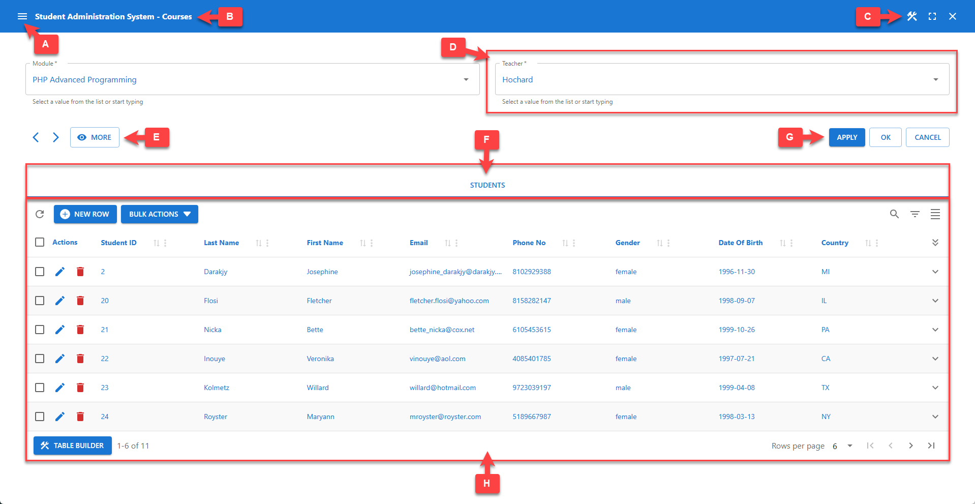
💡 Use the markers (A-H) shown in the screenshot above to identify the configurable options described below. Follow the links for more detailed information.
[A] App Menu
An app menu is automatically added to the toolbar of data apps to easily navigate between bundled apps.
📌 This feature is only available for Data Apps.
[B] App Title
The app title is displayed on the toolbar. You can change the title in the App Manager. You can apply additional CSS styles using the CSS class pp-toolbar-title. It is also possible to hide the toolbar and title completely on webpages using the shortcode parameter hidetitlebar.
[C] Toolbar Icons
Toolbar icons are located on the right side of the toolbar.
🛠️ Builder Icon
The left icon is the Builder icon, which allows administrators to access the Table Builder. The Builder icon is available on both the back-end and the front-end. You can disable it on the front-end using the shortcode parameter builders.
⛶ Full-Screen Mode
The second icon allows users to toggle between full-screen and windowed mode. This icon is only available to premium users. Full-screen mode can be disabled in the App Manager.
⛌ Close Icon
The Close icon is only available when an app is started from the App Builder. It allows administrators to close the app and return to the App Builder.
[D] Data Entry Fields
A data entry field is added for each table column. The screenshot above displays two data entry fields: Module and Teacher. Two additional fields are available through the MORE button, allowing users to interactively toggle the display of pre-defined fields. This behavior can be configured in the Columns menu. (read more...)
To ensure a consistent form layout, fields are positioned based on a grid. The default grid for a form can be configured in the Form menu in panel Grid. Detailed grid positioning is available on a per-column basis in the Column menu in panel Grid Positioning.
All required columns must be enterable during insert. Only auto-increment columns may be hidden. Primary key fields are not updatable.
The Form Builder supports computed fields to perform calculations and supports additional HTML elements to perform custom tasks and serve custom purposes. (read more...)
📌 Detailed data entry field configuration options are available from the Columns menu.
[E] Navigation Buttons
< Previous Row
Navigates to the previous row. If no previous row is available, the button is disabled.
📌 This feature can be disabled in the Form Builder. (read more...)
> Next Row
Navigates to the next row. If no next row is available, the button is disabled.
📌 This feature can be disabled in the Form Builder. (read more...)
👁 Show MORE | LESS
Toggles the visibility of all pre-defined columns. This behavior can be configured in the Columns menu. (read more...)
[F] Action Buttons
Action button labels are localized.
📌 The app language can be changed in the App Manager. (read more...)
📌 Button label translation can be overridden with custom translations. (read more...)
✔️ APPLY
Clicking the APPLY button saves all outstanding changes without leaving the form.
✅ OK
Clicking the OK button saves all outstanding changes and closes the form.
❌ CANCEL
Clicking the CANCEL button discards all outstanding changes and closes the form.
[G] Relationship Title
The relationship title is used for identification and navigation. Relationships can be displayed:
- In an accordion - the user needs to select an accordion panel to navigate to a specific relationship.
- With selectable tabs - the user needs to click a tab to navigate to a specific relationship.
- One after the other - the relationship titles (not clickable) are shown above the relationships.
📌 This feature can be configured in the Relationships panel. (read more...)
[H] Detail Table (or Form)
The container shown below the relationship title displays the detail table or form, depending on the user's interaction.
📌 Click the Table Builder button in the table footer to configure the detail table.
📌 Click the Form Builder button in the form footer to configure the detail form.